
Building Responsive Flutter Apps for Any Device: Complete 2026 Guide
Building Responsive Flutter Apps for Any Device
Building Responsive Flutter Apps for Any Device
· · Written by Virtuous Techlogic · 1 min read
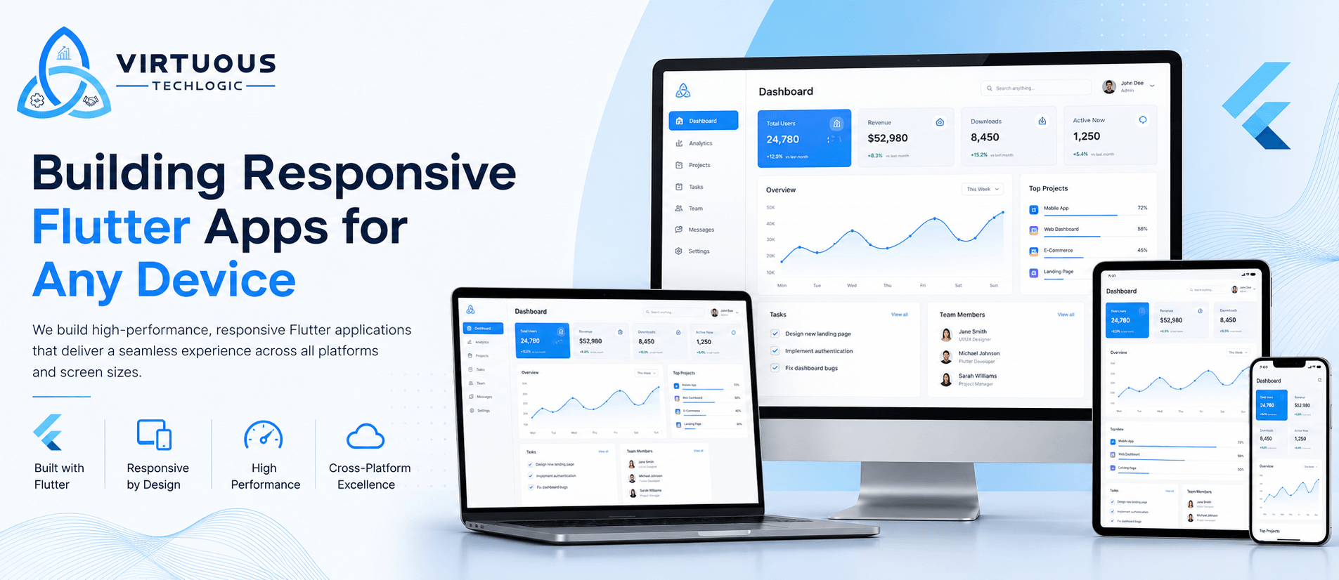
Building Responsive Flutter Apps for Any Device: A Complete Guide (2026)
Introduction
Today's users expect mobile applications to work seamlessly across smartphones, tablets, foldable devices, desktops, and the web. Whether someone is using a compact Android phone, an iPad, or a large desktop monitor, they expect a consistent, intuitive, and visually appealing experience.This growing diversity of devices has made responsive app development a necessity rather than a luxury.Flutter, Google's cross-platform UI toolkit, has become one of the best frameworks for creating responsive applications from a single codebase. Its flexible widget system, adaptive layouts, and rich customization capabilities allow developers to build apps that automatically adjust to different screen sizes without sacrificing performance or user experience.At Virtuous Techlogic, we specialize in developing responsive Flutter applications that provide exceptional experiences across Android, iOS, tablets, web, desktop, and foldable devices. Our team combines thoughtful UI/UX design with scalable Flutter architecture to help businesses launch future-ready digital products.
Why Responsive Design Matters in Flutter Apps
Responsive design isn't simply about resizing widgets. It's about delivering an optimized user experience regardless of device size or orientation.Modern users switch between devices throughout the day. They may begin browsing on a smartphone, continue on a tablet, and finish their task on a desktop. A responsive Flutter application ensures that every interaction feels natural and intuitive.Benefits include:
- Better user experience
- Higher user retention
- Improved accessibility
- Reduced maintenance costs
- Future-ready applications
- Stronger app store ratings
- Easier feature expansion
For startups and enterprises alike, investing in responsive Flutter development creates long-term value while reducing development complexity.
Why Flutter Is Perfect for Responsive Development
Flutter was designed with flexibility in mind.Unlike many traditional frameworks that rely on native UI components, Flutter renders everything using its own graphics engine. This provides developers with complete control over layout and appearance.Key advantages include:
Single Codebase
Develop once and deploy across:
- Android
- iOS
- Web
- Windows
- macOS
- Linux
This significantly reduces development effort while maintaining design consistency.
Flexible Widget System
Flutter provides an extensive collection of widgets that automatically adapt to different screen dimensions.Examples include:
- Expanded
- Flexible
- FractionallySizedBox
- LayoutBuilder
- MediaQuery
- Wrap
- AspectRatio
These widgets help create layouts that scale naturally.
Hot Reload
Flutter's Hot Reload allows developers to instantly preview UI changes.Benefits include:
- Faster iteration
- Easier debugging
- Rapid UI experimentation
- Reduced development time
High Performance
Flutter compiles directly into native machine code.This enables:
- Smooth animations
- Fast rendering
- Responsive scrolling
- Native-like performance
Key Principles of Responsive Flutter Design
1. Avoid Fixed Widths
Instead of writing:
width: 300
Use:
MediaQuery.of(context).size.width * 0.8
This allows layouts to adjust automatically.
2. Use LayoutBuilder
LayoutBuilder helps developers create different interfaces depending on available space.Example:
- Mobile layout
- Tablet layout
- Desktop layout
without creating separate applications.
3. Leverage MediaQuery
MediaQuery provides information about:
- screen width
- screen height
- orientation
- text scaling
- padding
- safe areas
Using this information allows widgets to resize intelligently.
4. Build Adaptive Navigation
Navigation should evolve with screen size.Examples:Small screens
- Bottom Navigation Bar
Medium screens
- Navigation Rail
Large screens
- Side Navigation Drawer
Flutter makes switching between these layouts straightforward.
5. Design for Orientation Changes
Apps should function beautifully in both:
- Portrait
- Landscape
Responsive layouts improve usability for tablets and foldable devices.
Responsive Flutter Widgets You Should Use
Several Flutter widgets simplify responsive development.
Flexible
Allows widgets to resize proportionally.Perfect for:
- Cards
- Forms
- Dashboards
Expanded
Occupies remaining available space.Ideal for:
- Lists
- Product pages
- Split layouts
Wrap
Automatically wraps widgets to the next line.Useful for:
- Chips
- Categories
- Filters
- Tags
GridView
Excellent for:
- Product catalogs
- Photo galleries
- Dashboards
Grid spacing adjusts dynamically.
AspectRatio
Maintains proportional scaling.Useful for:
- Videos
- Images
- Banners
Supporting Tablets and Foldable Devices
Tablet usage continues to grow across education, healthcare, logistics, and enterprise environments.Responsive Flutter apps should:
- Increase content density
- Use multi-column layouts
- Display larger navigation panels
- Improve multitasking support
Foldable devices require additional consideration because screen dimensions change dynamically.Flutter's layout tools make supporting foldables much easier.
Responsive Flutter Apps for the Web
Flutter Web allows businesses to reuse much of their mobile codebase.However, web users expect different interactions.Consider:
- Hover effects
- Keyboard shortcuts
- Mouse support
- Larger layouts
- Responsive typography
At Virtuous Techlogic, we optimize Flutter Web applications for desktop browsers while maintaining a unified experience across devices.
Common Mistakes to Avoid
Many Flutter projects struggle with responsiveness because of avoidable mistakes.Examples include:
Using fixed pixel values
Hardcoded dimensions break on different screens.
Ignoring Safe Areas
Apps may overlap with:
- Notches
- Status bars
- Dynamic islands
Always use SafeArea when appropriate.
Poor font scaling
Text should remain readable on every screen size.
Large images
Optimize assets for different resolutions to improve performance.
Testing only on one device
Always test on:
- Android phones
- iPhones
- Tablets
- Foldables
- Desktop
- Web
Best Practices for Responsive Flutter Development
Professional Flutter teams follow consistent practices.These include:✔ Design mobile-first✔ Create reusable widgets✔ Use responsive spacing✔ Maintain consistent typography✔ Test multiple breakpoints✔ Optimize image assets✔ Support accessibility✔ Minimize widget rebuilds✔ Separate UI from business logic
How Virtuous Techlogic Builds Responsive Flutter Apps
At Virtuous Techlogic, responsiveness is part of our development process—not an afterthought.Our Flutter development approach includes:
Discovery
Understanding user journeys across devices.
UI/UX Design
Creating responsive wireframes and prototypes.
Flutter Development
Building adaptive interfaces using Flutter best practices.
Backend Integration
Connecting Firebase, Supabase, REST APIs, GraphQL, payment gateways, and cloud services.
Quality Assurance
Testing across:
- Android
- iOS
- Tablets
- Foldables
- Desktop
- Web
Continuous Improvement
Providing ongoing maintenance, feature upgrades, analytics, and performance optimization.
Success Story: Building a Responsive Marketplace App
A startup approached Virtuous Techlogic to build a marketplace platform that needed to support:
- Android
- iOS
- Tablets
- Web
The challenge was maintaining a consistent shopping experience across every device.Our Flutter team developed:
- Adaptive layouts
- Responsive product grids
- Dynamic navigation
- Optimized image loading
- Cloud backend integration
- Secure payment gateway support
The result was a scalable Flutter application that delivered a smooth experience regardless of screen size, enabling the client to launch across multiple platforms from a single codebase.
Future Trends in Responsive Flutter Development
Flutter continues to evolve rapidly.Emerging trends include:
- AI-powered adaptive interfaces
- Foldable device optimization
- Desktop-first Flutter applications
- Dynamic UI personalization
- Voice-first interfaces
- Material 3 responsive components
- Multi-window application support
- Better accessibility features
Businesses investing in responsive Flutter today will be well-positioned for tomorrow's devices.
Conclusion
Responsive design has become a core requirement for successful digital products. Users expect applications to work flawlessly across smartphones, tablets, desktops, web browsers, and emerging device categories.Flutter provides one of the most powerful frameworks for building adaptive, high-performance applications from a single codebase. By following responsive design principles, using the right Flutter widgets, and testing across multiple devices, businesses can deliver exceptional user experiences while reducing development costs.At Virtuous Techlogic, we help startups, SMEs, and enterprises build scalable Flutter applications that are responsive, secure, and ready for future growth. Whether you're launching a new MVP or modernizing an existing application, our team delivers solutions that perform beautifully on every screen.
Frequently Asked Questions
Build Your App with Virtuous Techlogic
Book a Free ConsultationTrusted by clients across Clutch and Upwork
Want proof before starting? View our client reviews and agency profiles on Clutch and Upwork.